p5.js Sketches
1. Experimental Clock, Sept. 2022 - Link
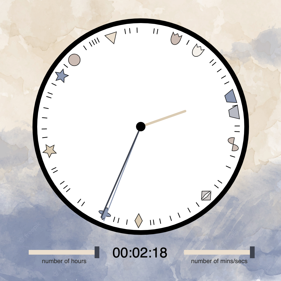
This clock subverts the implications of a normal clock to better reflect our subjective experience of time.
In a normal clock, the increasing numbers arranged clockwise around the rim imply that time always progresses forwards in an orderly fashion. The fixed distances between ticks on the face implies that time always moves at the same speed. However, in our lives, time is frequently experienced in a disorderly fashion, with time jumps occurring during sleep; or, time moves in a backwards motion, with memories taking us to time jumps in the past; or, time is dilated, according to the saying "time flies when you're having fun". Thus, this experimental clock aims to present these possibilities of experiencing time differently.
Hours are represented by shapes instead of numbers, removing any implied order from one to the next. Instead, the order of hours is randomized in every 24-hour period. This randomization allows the hands to move either clockwise or counter-clockwise, removing the strictly forward motion of the clock. Tick placements and orders are also randomized, allowing minutes and seconds the same freedom from order and forward motion. Finally, the timespans within each hour, minute, and second are also randomized within each day. No day is ever exactly the same as another, and this randomization reflects that uniqueness. The sliders along the bottom allow additional freedom to increase or decrease the number of hours, minutes, and seconds in a day.
2. Binaural Beats, Oct. 2022 - Link
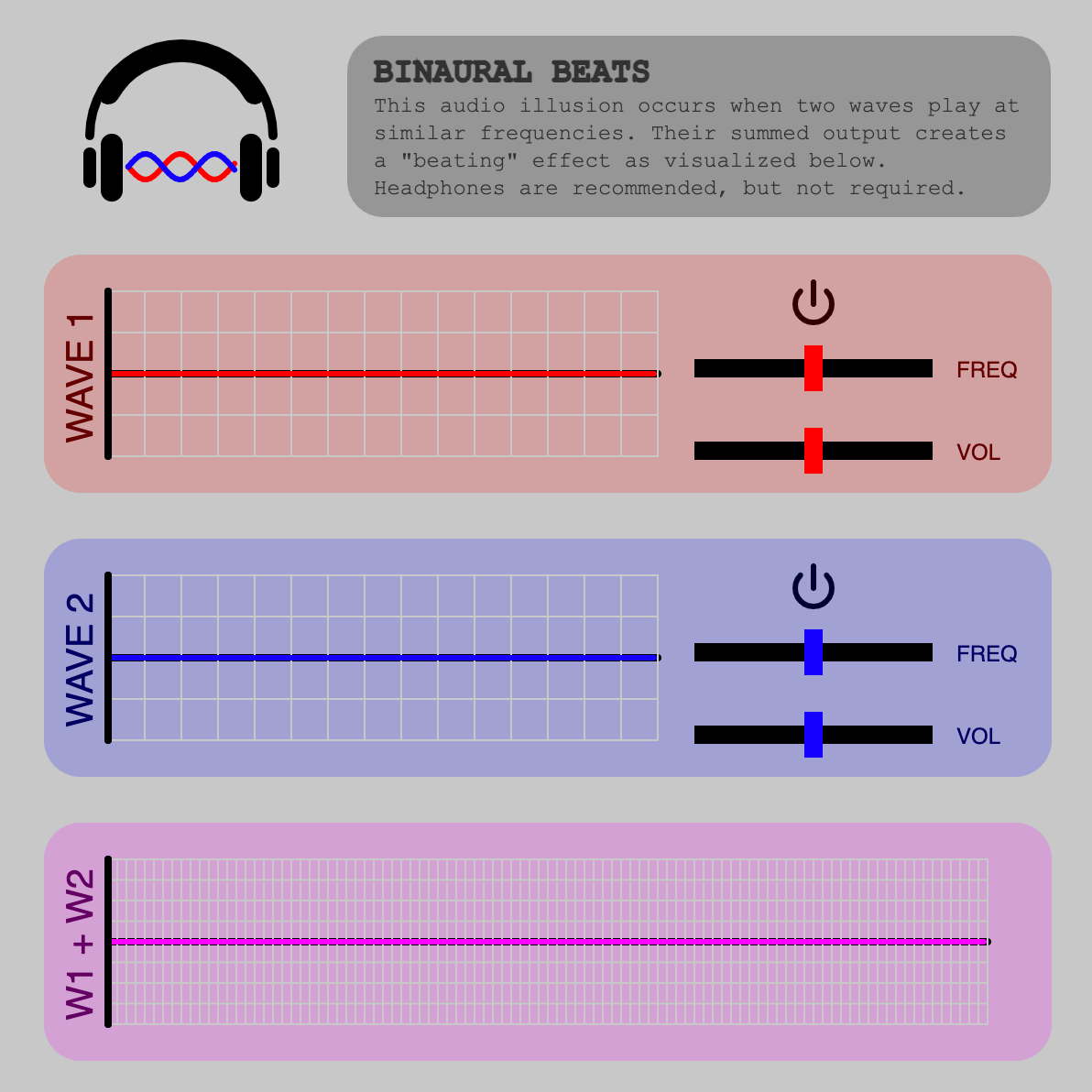
The "beating" illusion is an auditory illusion that sounds like a repetitive "beat" effect when two waves play at very similar frequencies. This is a result of their constructive and destructive interferences creating a new periodic pattern when summed, which can be seen in the purple graph.
This sketch allows you to both see and hear this phenomenon, which enables a better understanding of why this effect occurs. The frequency and volume of both waves can be adjusted to see and hear how these parameters affect the summed wave.
3. Data Portrait: Digital Connections, Oct. 2022 - Link
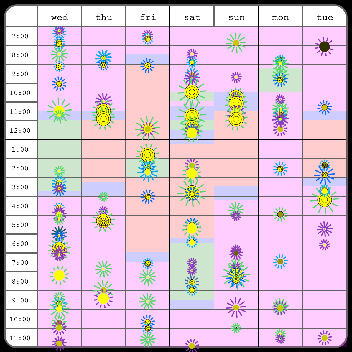
I collected data points of each time I connected with someone digitally in a non-school or work related context. In the past, I've gone through very isolated periods where I didn't talk to almost anyone in-person or digitally, so I wanted to make this portrait to show myself how far I've come.
For each data point, I collected information about the time, the person, the platform, and the kind of communication. The size of each circle corresponds to how long I've known the person; circles with multiple rings represent group chats, with each ring representing how long I've known each person in that chat. The color of each circle represents each person's significance to me, ranging from bright yellow for my closest friends to grey for acquaintances or strangers. The length and speed of rotation of the rays coming out from each circle correspond to the type of communication, either a conversation, a short exchange, or sending memes. Finally, the color of the rays reflects the color of the platform that was used - iMessage text, Facebook Messenger, Twitter, Discord, Whatsapp, or Instagram. The background colors reflect where I was during those time periods: magenta for home, blue for in transit, red for school, and green for other.